FITNESS LIFE MARKETING……7 Strategies to Improve the Effectiveness of Your Health Club’s Website!
You never get a second chance to make a first impression. This is especially true when it comes to your health club’s website. In this day and age, your prospects will seek you out on the Internet long before they stop in or even call. So you want to make sure your website offers an attractive peek into what they can expect as members of your club. Here are 7 strategies to help make sure your website drives prospects to your club.
First and foremost, you need a way to collect visitor information. This is probably the most important element of an effective health club website. You already know you need to collect visitor information when a prospect visits your club. Apply that same strategy to your website! It is as simple as offering a 14 day trial membership in exchange for your visitor’s email address. The best way to do this is to have an opt-in form on your site, that is linked to an autoresponder system such as Aweber or Constant Contact. By collecting their information, you will have the opportunity to send them information about your club, fitness and nutrition tips, and a method of communication if they forget to redeem their trial membership.
Try to use pictures of your actual members on your site. Too many websites have the same stock photographs on their website. Images of real members from your club as well as your staff members are always more powerful than using images of people who are obviously models. Prospects will be turned off if you have a site loaded with pictures of people they cannot relate to. I recommend a “Gallery” of photos somewhere on your site.
Set up a “Partners” page on your website. This works well for a couple of reasons. First it looks like you’re a major part of the community. Prospects will likely see stores where they’ve shopped, and in turn feel comfortable with you through a mutual connection. But more importantly, this provides you a great opportunity to offer something of value to your neighbor businesses in exchange for something they can do for you.
Emphasize your most important message on your home page. If you’re the best, make sure you tell them you’re the best. If you’re the biggest club, the only 24 hour club, the club with the best service, the “guaranteed results” club…you have to tell them right away! What is it that is your best selling feature…your Unique Selling Proposition? What makes you different from the other fitness options in town? You want to make sure they know this right away. Make sure there is no doubt what message you want a visitor to know right away.
Always use dark font against a light background. Too many websites try to get fancy and put a dark background with light colored font…this is a mistake. If someone tries to read more than a few sentences of light text against a dark background, it will strain their eyes. Menus and headers can use a darker color, but the main content area needs to be white or a very light color.
Limit the number of menu tabs on your site. I’ve seen some websites that have up to 20 different menus on their site! I say no more than 6. You can easily develop subcategories for each of these. For example, don’t have a tab for group fitness and boot camp and massage and tanning and personal training and childcare. Have a tab called “Services” and have each of these a subcategory. Drop down tabs are especially useful for this.
Make sure your website is better than your competitors’ sites. This one probably goes without saying. If your prospects look at your website and look at your competitor’s website, they will call or visit the one that they like most. Make sure your site is prettier, more user friendly, and more informative than the websites of your competitors.
Sponsored by: Fitness Life Marketing 1-888-541-0714 ext2
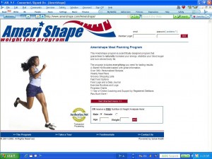
Article Research Contributor: Amerishape Weight Loss

